UI Templates
Single AssetsUI UX Kits
Complete KitsBriefs
Practice Like A ProStyles Guides
Colors With TypeJobs
100% Remote Jobs
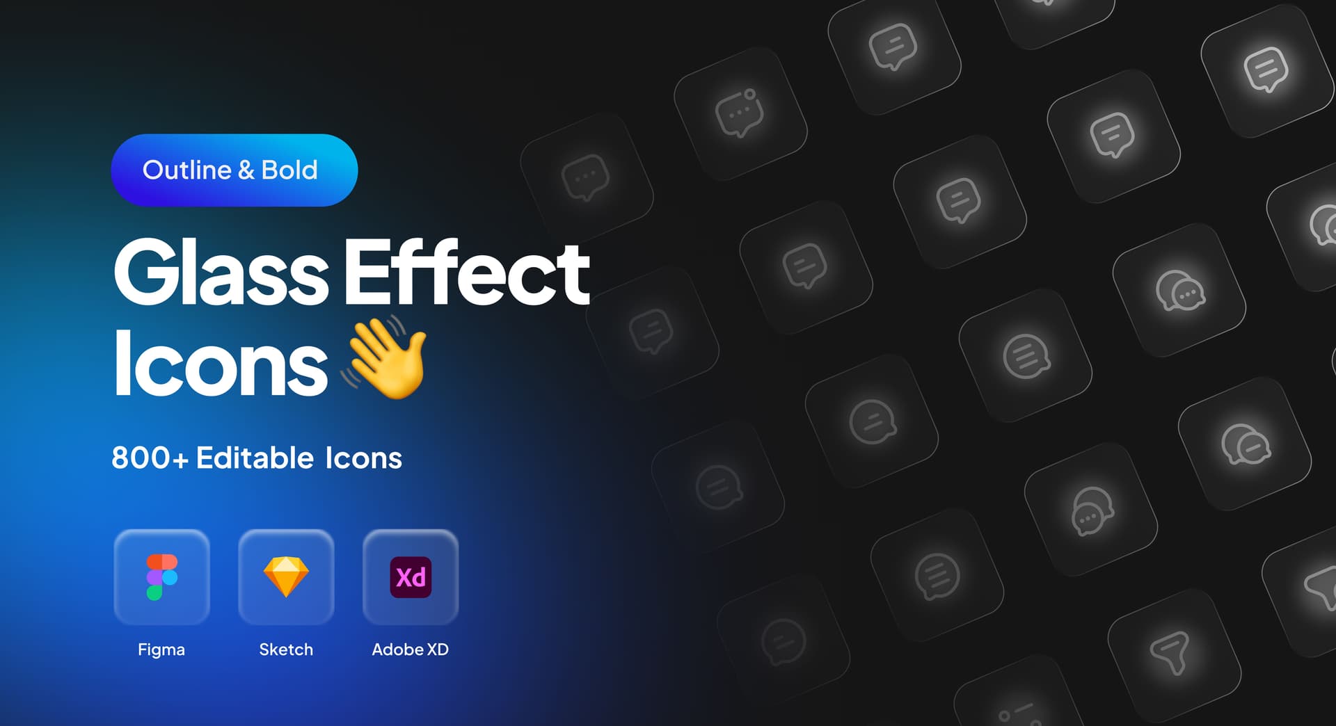
Glass Effect Icons Set
The Glass Effect Icons Set is a versatile design resource created specifically for Figma. It providing a comprehensive solution for designing websites and apps. With 800+ icons, you'll have everything you need to create the essential nav bar of your website and apps. This kit will expedite your design process and help you create a visually appealing and user-friendly website.
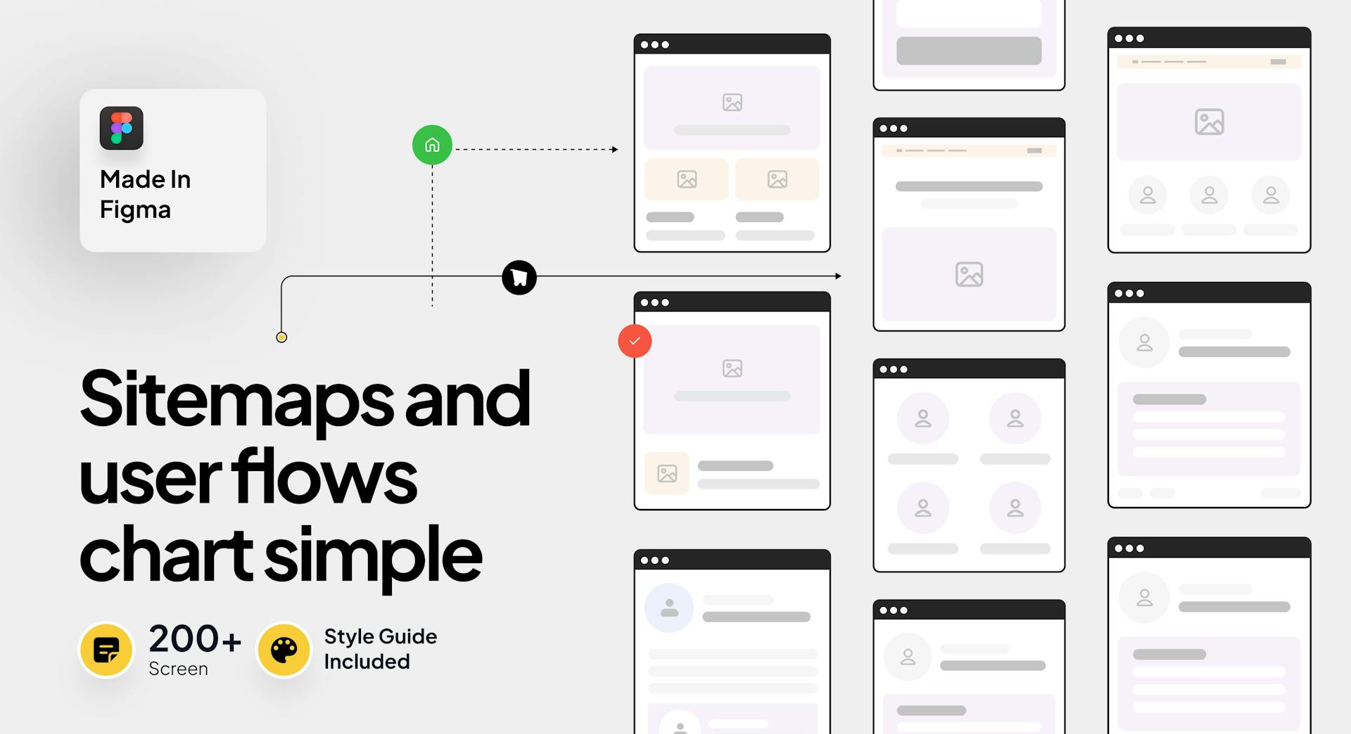
User Flow UI Kit
The User Flow UI Kit is a versatile design resource created specifically for Figma. It providing a comprehensive solution for designing websites. With 200+ screens, you'll have everything you need to create the essential user flow of your website. This kit will expedite your design process and help you create a visually appealing and user-friendly website.
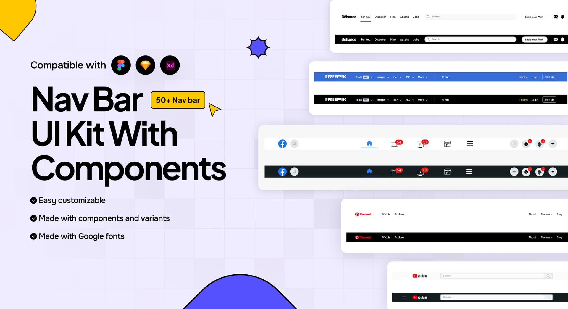
Navigation Bar UI Kit
The Navigation Bar UI Kit is a versatile design resource created specifically for Figma. It providing a comprehensive solution for designing websites. With 50+ navigation bar, you'll have everything you need to create the essential nav bar of your website. This kit will expedite your design process and help you create a visually appealing and user-friendly website.
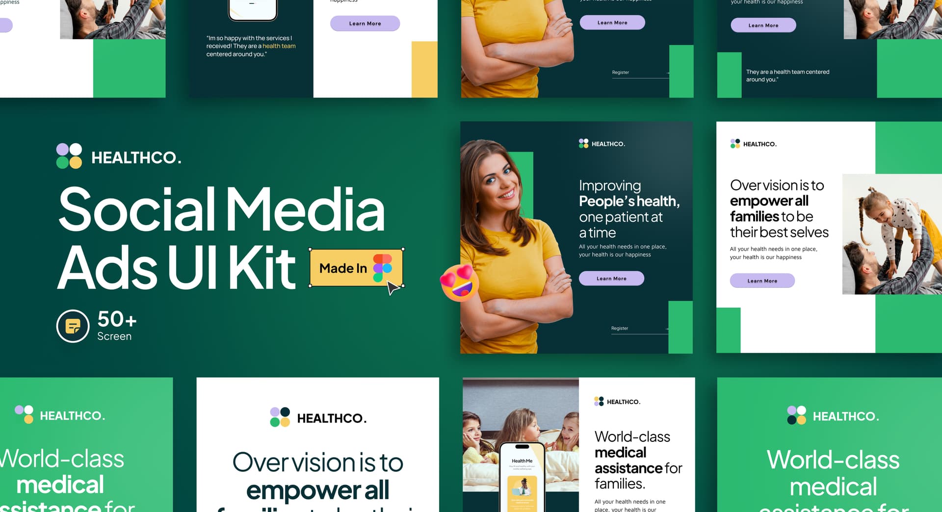
Social Media Ads UI Kit
The Social Media UI Kit is a versatile design resource created specifically for Figma. It includes social media marketing ads, and a style guide, providing a comprehensive solution for designing social ads. With 50+ screens you'll have everything you need to create the Social Media Ads like Facebook Marketing Ads, Twitter Marketing ads, Google Marketing Ads & LinkedIn Marketing ads. The UI kit offer a solid foundation for the layout and structure of each page or screens, while the style guide & typography ensures consistency in design elements throughout the ads. This kit will expedite your design process and help you create a visually appealing and user-friendly marketing ads.
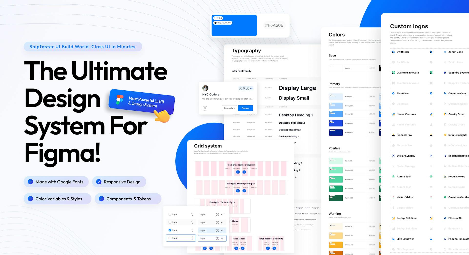
Ultimate Figma Design System V1
The Ultimate Figma Design System V1 UI Kit is a Figma design resource that includes Buttons, Avatars,Dropdown, Shadow, Alert, Pagination, List items, Search, Tables, Tab, Badges,Media Mockups, Social Media,Brand Logo, Spacing, Margins & Padding Guidelines, Empty States,Pop up, Components, Progress Indicators, Tool Tip,Loaders,Mobile & desktop Logos & Headers. It provides designers with a foundation to kickstart their projects for a design tool project, allowing them to quickly create a consistent and visually appealing user interface. The Design System 1.0 offers a selection of essential systems and a comprehensive set of components and proper guidelines,making it easier to maintain design consistency throughout the project.
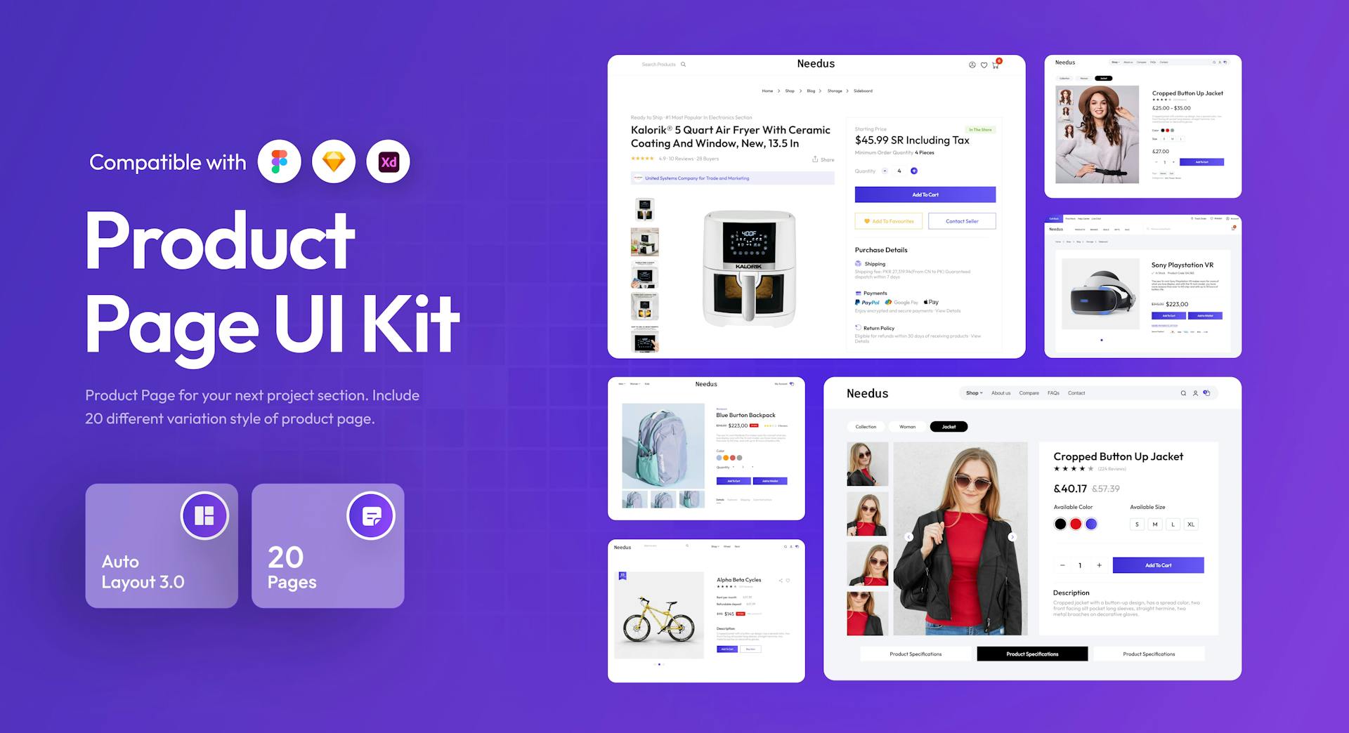
Product Page UI Kit
The Product page UI Kit is a versatile design resource created specifically for Figma. It include a style guide, providing a comprehensive solution for designing a product page website. With 20 screens. The pages offer a solid foundation for the layout and structure of product page, while the style guide ensures consistency in design elements throughout the product page of website. This kit will expedite your design process and help you create a visually appealing and user-friendly websites.
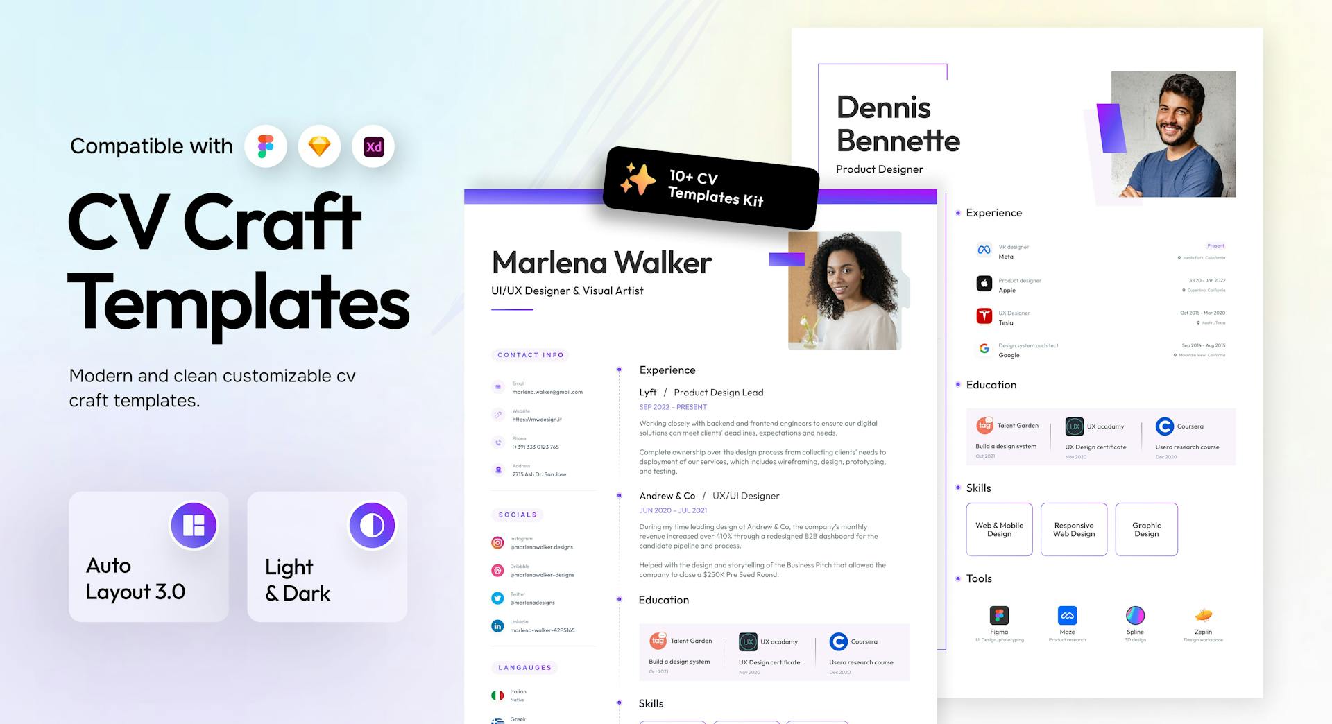
Resume Templates UI Kit
The Resume Template UI Kit is a comprehensive design resource exclusively available in Figma,Sketch & XD. It comprises over 16 collections, complete with style guide, component, autolayout, dark & light mode. With this kit, designers can swiftly create visually appealing and user-friendly resumes.
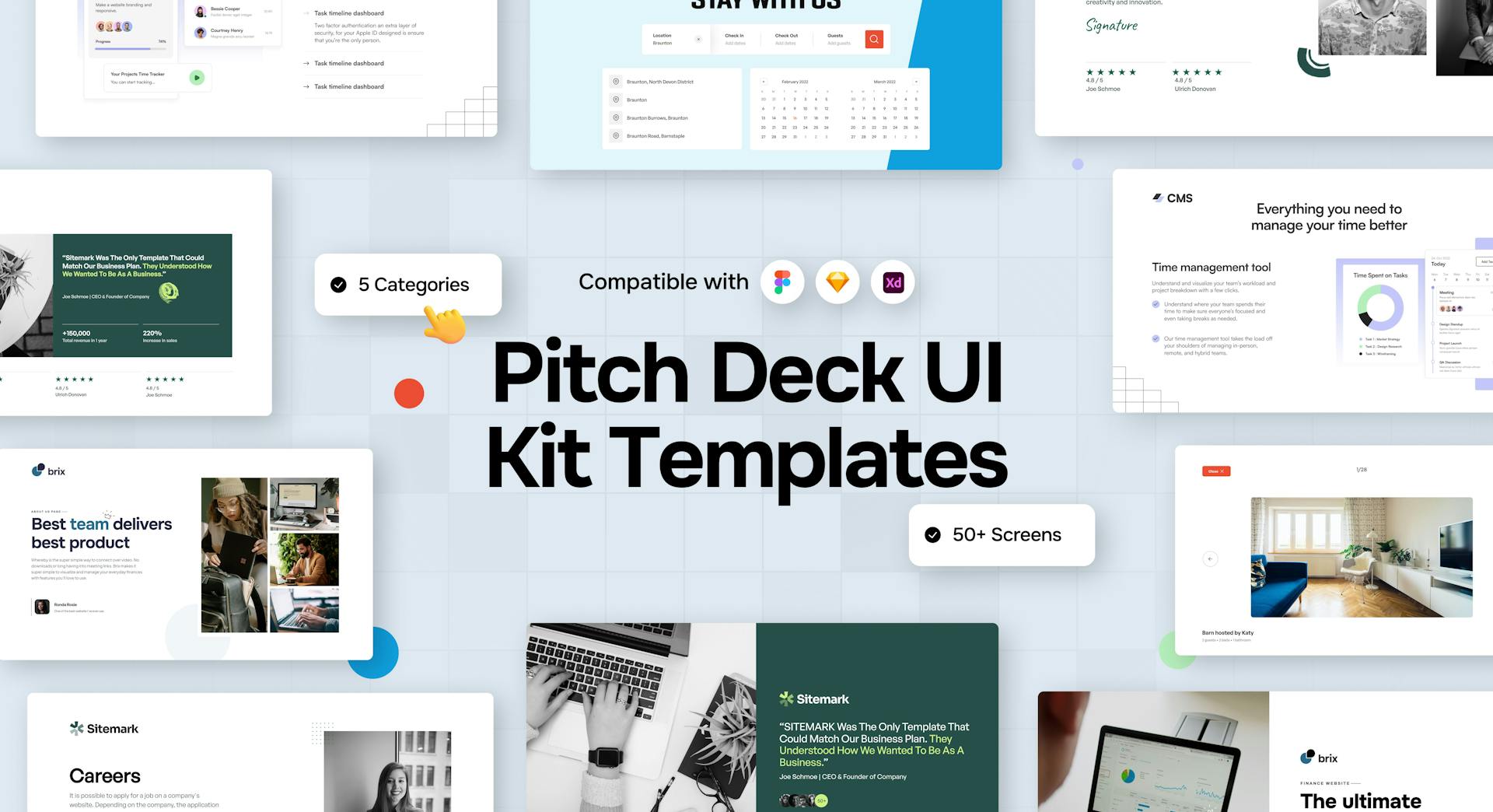
Pitch Deck UI Kit Template
The Pitch Deck UI Kit Template is a versatile design resource created specifically for Figma. It includes style guide, providing a comprehensive solution for designing a pitch deck template ui kit with 50 screens included Travel Booking Templates, Business Templates,Finance Templates, Ecommerce Templates & CMS Templates. Pitch deck is a brief presentation that gives potential investors or clients an overview of your business plan, products, services and growth traction. This pitch deck is a visual presentation that tells the story of a business to persuade and engage potential investors.
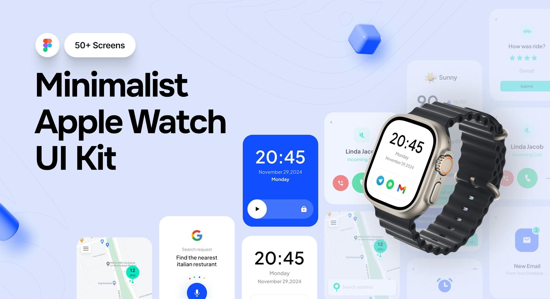
Apple Watch UI Kit
The Apple Watch UI Kits is a comprehensive design resource exclusively available in Figma. It comprises over 50+ collections, complete with a style guide and components. With this kit, designers can swiftly create visually appealing and user-friendly watch kit. The pre-designed collections, along with the included style guide and components, pixel perfect, organised layers, full editable & free fonts ensure design consistency and expedite the development process for a seamless watch ui experience.
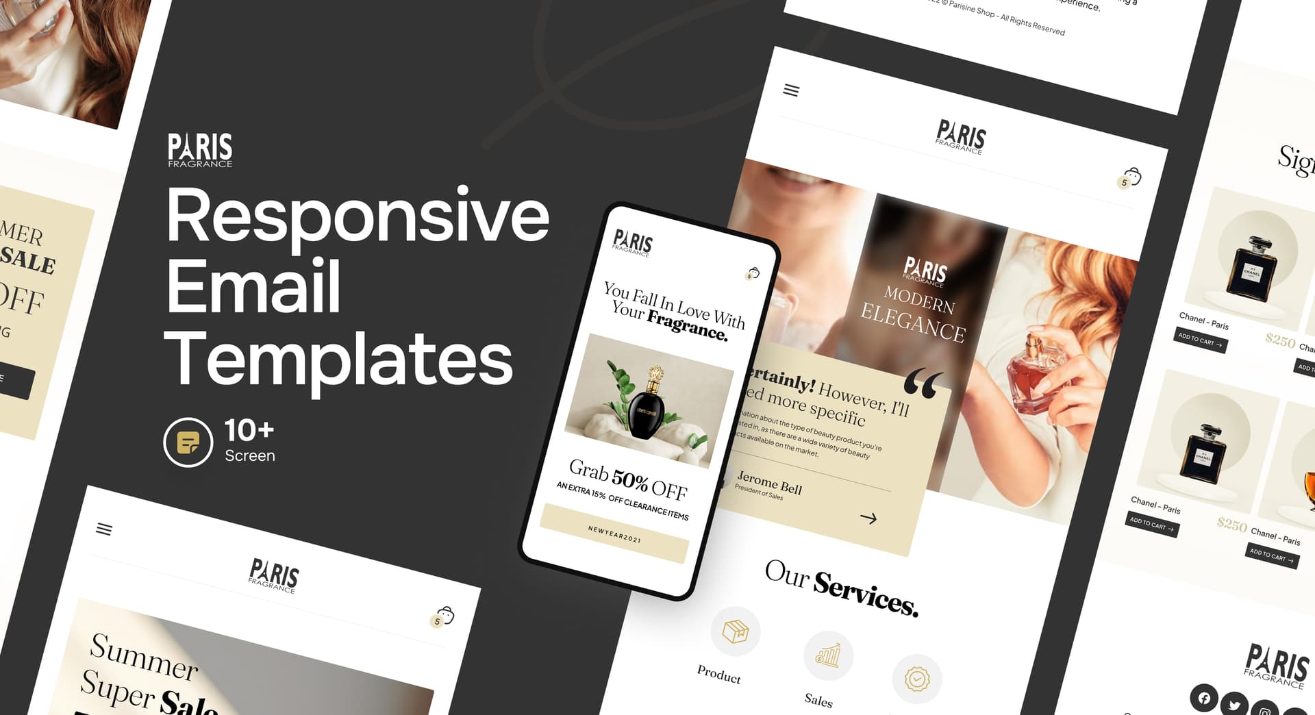
Email Templates UI Kit
The Email Template UI Kit is a comprehensive design resource exclusively available in Figma,Sketch & XD. It comprises over 10 collections, complete with Home, Services, About, Collection & Sale pages. With this kit, designers can swiftly create visually appealing and user-friendly interfaces for apps and websites. The pre-designed collections, along with the included style guide and components, ensure design consistency and expedite the development process for a seamless apps & websites experience.
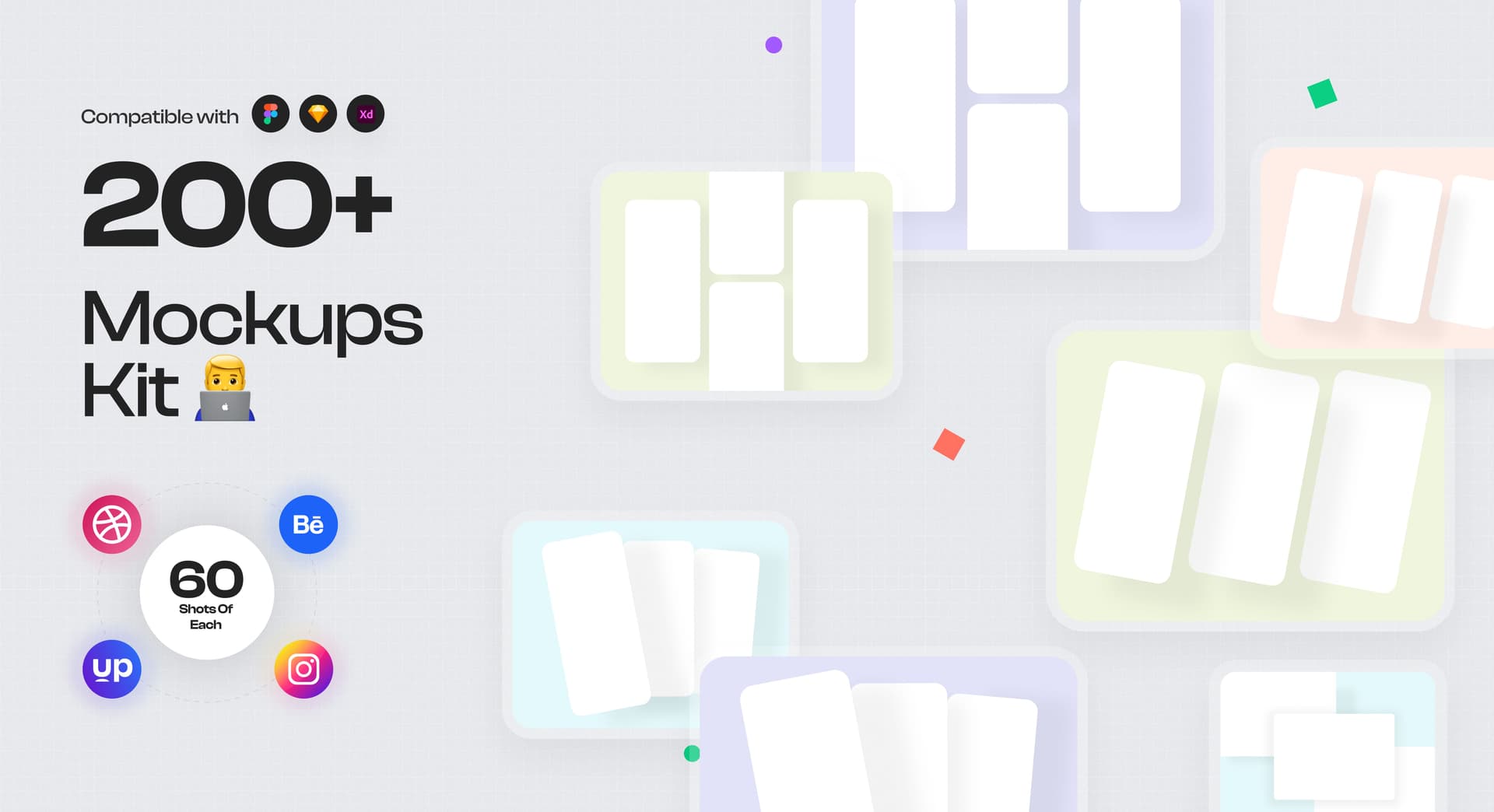
Mockup Kit
The Mockup Kit is a comprehensive design resource exclusively available in Figma. It comprises over 200+ collections, complete with a Design System & style guide,Easily Drag & Drop with different Variations. With this kit, designers can swiftly create visually appealing and user-friendly interfaces for apps and more. The pre-designed collections, along with the included style guide and , ensure design consistency and expedite the development process for a seamless app, website and portfolio experience.
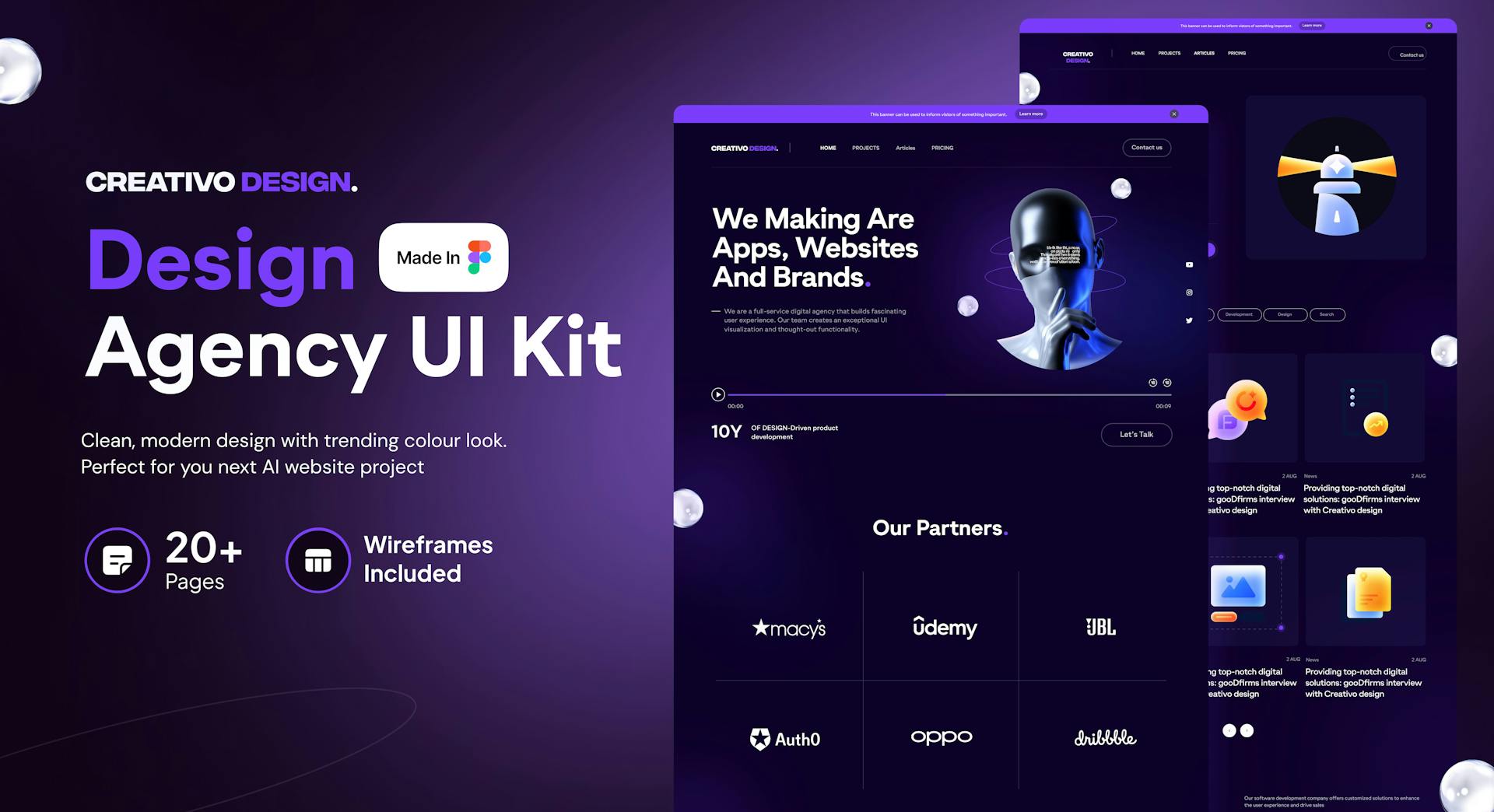
Design Agency UI Kit
The Design Agency UI Kit is a versatile design resource created specifically for Figma. It includes wireframes, mobile versions, and a style guide, providing a comprehensive solution for designing a design agency website. With 20+ pages, you'll have everything you need to create the essential pages of your website, including the home page, company/about page, pricing page, blog page, and contact us page. The wireframes offer a solid foundation for the layout and structure of each page, while the style guide ensures consistency in design elements throughout the website. This kit will expedite your design process and help you create a visually appealing and user-friendly design agency website.
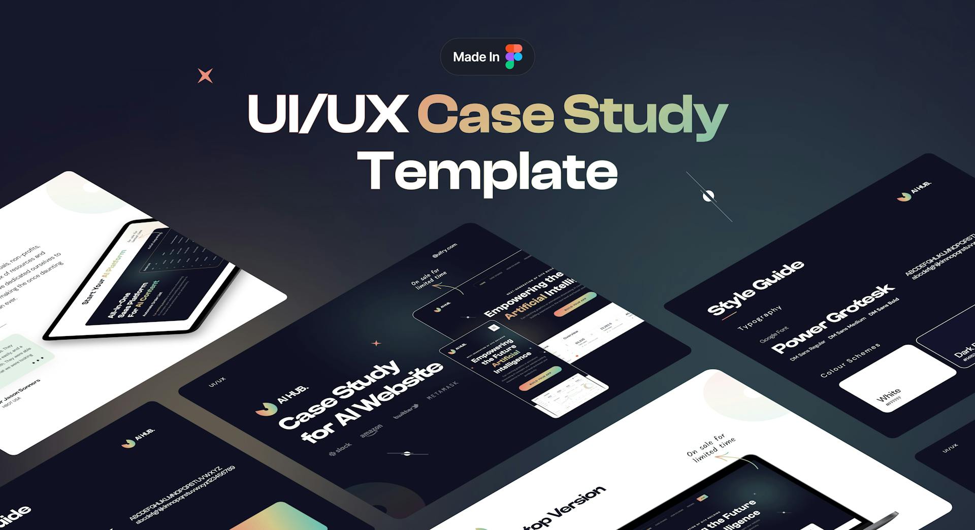
UI/UX Case Study Template
The UI/UX Case Study Website Template is a versatile design resource created specifically for Figma. It includes wireframes, and a style guide, providing a comprehensive solution for designing a case study website template. With 4 sections, you'll have everything you need to create the essential sections of your website, including the home page, company/about page, pricing page, blog page, and contact us page. The wireframes offer a solid foundation for the layout and structure of each page, while the style guide ensures consistency in design elements throughout the website. This template will expedite your design process and help you create a visually appealing and user-friendly case study website.
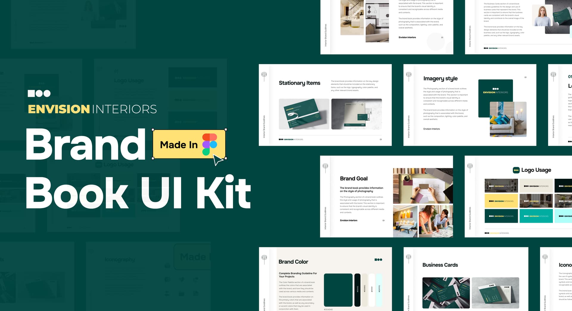
Brand Book UI Kit
The Brand Book UI Kit is a comprehensive design resource exclusively available in Figma. It comprises over 100+ collections, complete with a Design System & style guide, Logo & Mark Design, Color Typography, Photography, Icons & Illustration & Brand Application. With this kit, designers can swiftly create visually appealing and user-friendly interfaces for apps and websites. The pre-designed collections, along with the included style guide and components, ensure design consistency and expedite the development process for a seamless apps & websites experience.
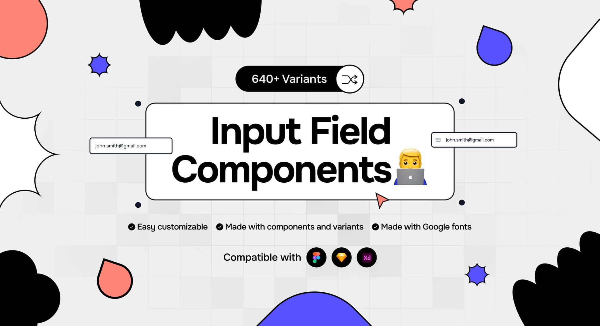
Input Fields Components UI Kit
The Input Fields Components UI Kits is a comprehensive design resource exclusively available in Figma. It comprises over 640+ collections, complete with a Design System & style guide, Autolayout Support, Easily Drag & Drop and 640 different Variations. With this kit, designers can swiftly create visually appealing and user-friendly interfaces for apps and more. The pre-designed collections, along with the included style guide and components, ensure design consistency and expedite the development process for a seamless app & website experience.
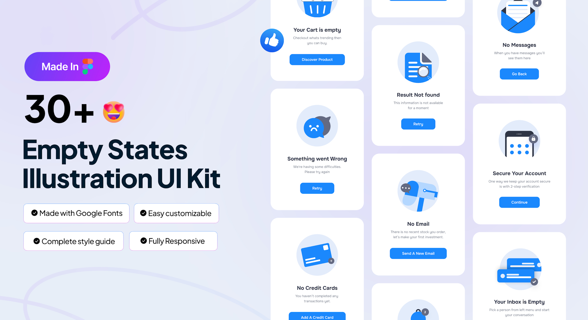
Empty States Illustration UI Kit
The Empty States Illustration UI Kit is a versatile design resource created specifically for Figma. It includes mobile versions, and a style guide, providing a comprehensive solution for designing an App and website. With 30+ pages, you'll have everything you need to create the essential pages of your website and an app .The Empty States Illustration UI Kit offer a solid foundation for the layout and structure of each page, while the style guide ensures consistency in design elements throughout the website and app. This kit will expedite your design process and help you create a visually appealing and user-friendly website.
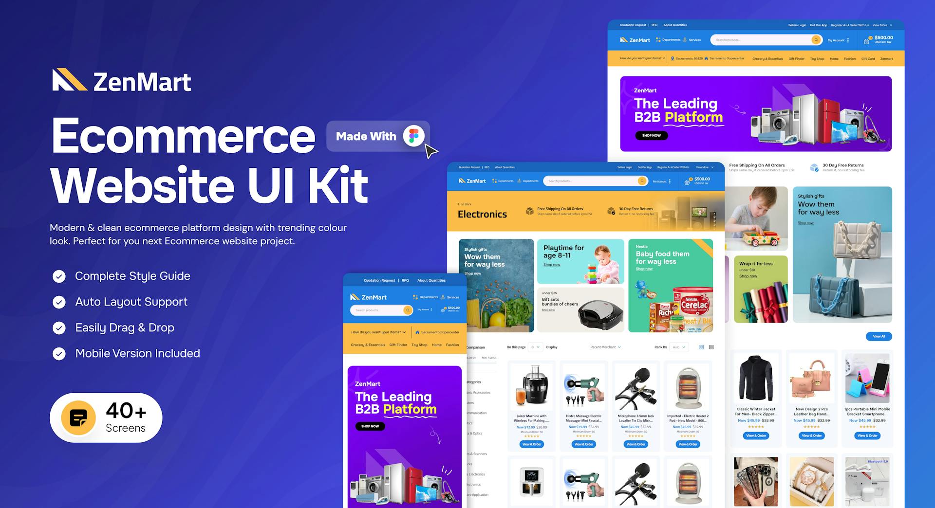
E Commerce UI Kit
The Ecommerce Website UI Kit is a versatile design resource created specifically for Figma. It includes wireframes, mobile versions, and a style guide, providing a comprehensive solution for designing a Ecommerce ui kit website. With 40+ screens, you'll have everything you need to create the essential pages of your website, including the home page, company/about page, pricing page, blog page, and contact us page. The wireframes offer a solid foundation for the layout and structure of each page, while the style guide ensures consistency in design elements throughout the website. This kit will expedite your design process and help you create a visually appealing and user-friendly websites.
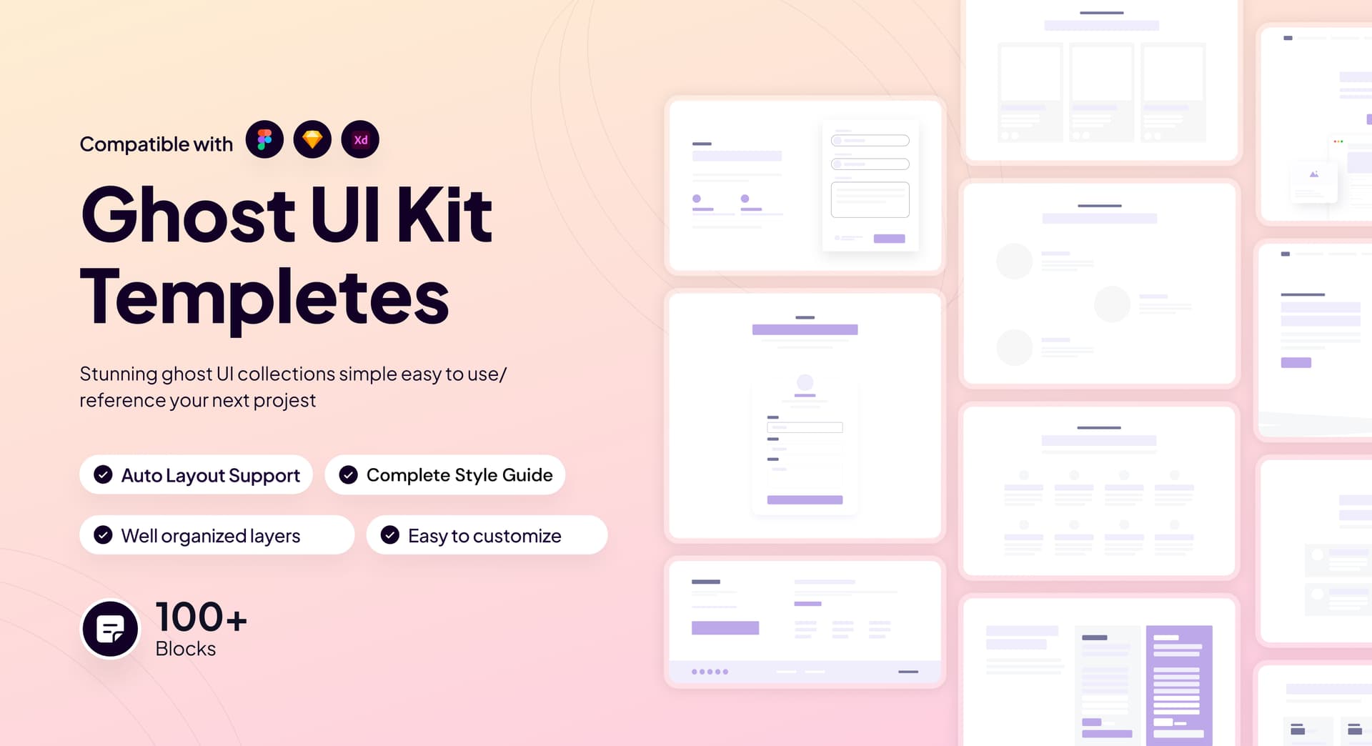
Ghost UI Kit
The Ghost UI Kit is a versatile design resource created specifically for Figma. It includes wireframes, mobile versions, and a style guide, providing a comprehensive solution for designing a finance website. With 100+ pages, you'll have everything you need to create the essential pages of your website, including the home page, company/about page, pricing page, blog page, and contact us page. The wireframes offer a solid foundation for the layout and structure of each page, while the style guide ensures consistency in design elements throughout the website. This kit will expedite your design process and help you create a visually appealing and user-friendly website.
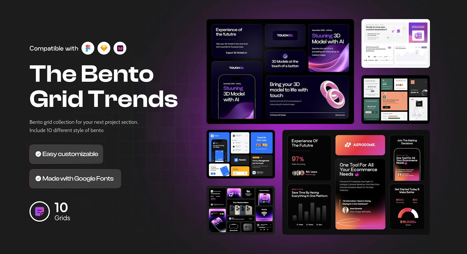
Bento Grid UI Kit
The Bento Grid UI Kit is a versatile design resource created specifically for Figma. It includes mobile and website versions, and a style guide, providing a comprehensive solution for designing an app or website. With 10 bento designs you'll have everything you need to create the essential pages of your website and screens of an app. The BentoUI kit offer a solid foundation for the layout and structure of each page or screens, while the style guide ensures consistency in design elements throughout the website and an app. This kit will expedite your design process and help you create a visually appealing and user-friendly website or an app.
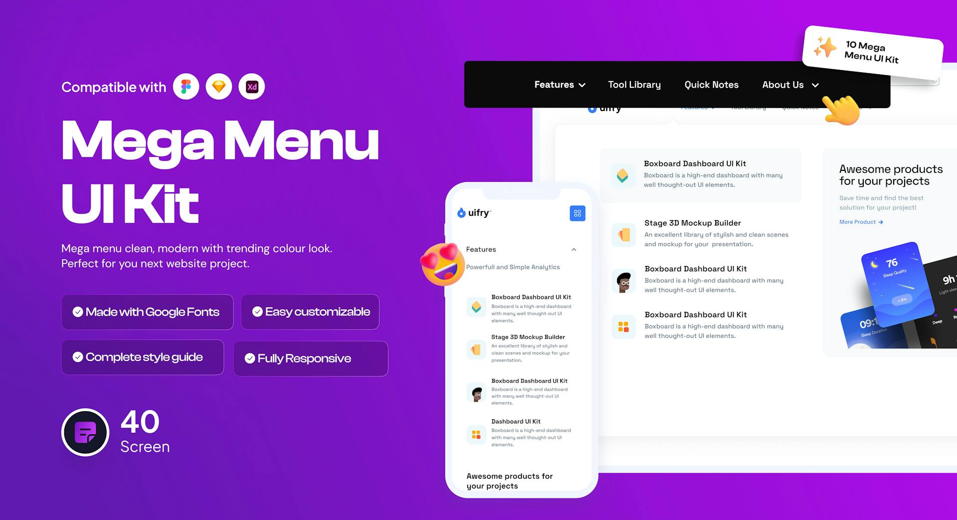
Mega Menu UI Kit
The Mega Menu UI Kit is a versatile design resource created specifically for Figma. It includes mobile and website versions, and a style guide, providing a comprehensive solution for designing an app or website. With 40+ you'll have everything you need to create the essential pages of your website, including the home page, company/about page, pricing page, blog page, and contact us page. The UI kit offer a solid foundation for the layout and structure of each page or screens, while the style guide ensures consistency in design elements throughout the website and an app. This kit will expedite your design process and help you create a visually appealing and user-friendly website or an app.
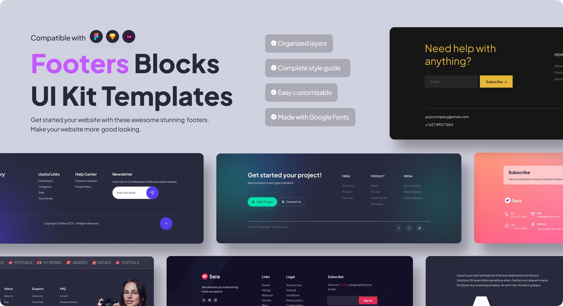
Footers UI Kit
The footers UI Kit is a versatile design resource created specifically for Figma. It providing a comprehensive solution for designing websites. With 20+ footers, you'll have everything you need to create the essential footers of your website. This kit will expedite your design process and help you create a visually appealing and user-friendly website.
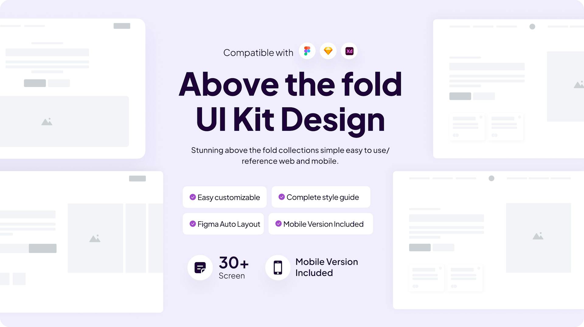
Above the Fold UI Kit
Above the Fold UI Kit is a versatile design resource created specifically for Figma. It includes wireframes, mobile versions, and a style guide, providing a comprehensive solution for designing an app or Websites. With 30+ pages & Screens, you'll have everything you need to create the essential pages and screens of your website and app.The wireframes offer a solid foundation for the layout and structure of each page, while the style guide ensures consistency in design elements throughout the website and app. This kit will expedite your design process and help you create a visually appealing and user-friendly app and website.
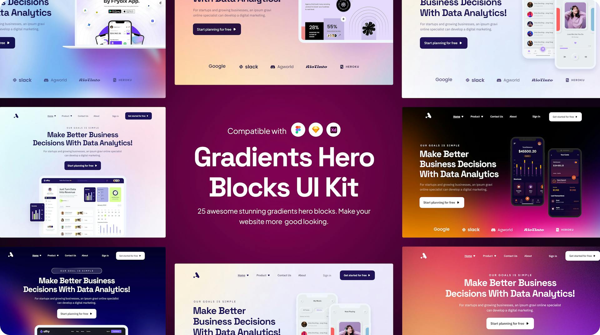
Gradients Hero Blocks UI Kit
The Gradients Hero Blocks UI Kit is a comprehensive design resource exclusively available in Figma. It comprises over 20+ collections, complete with a style guide and components . With this kit, designers can swiftly create visually appealing and user-friendly interfaces for apps and more. The pre-designed collections, along with the included style guide and components, ensure design consistency and expedite the development process for a seamless app experience.
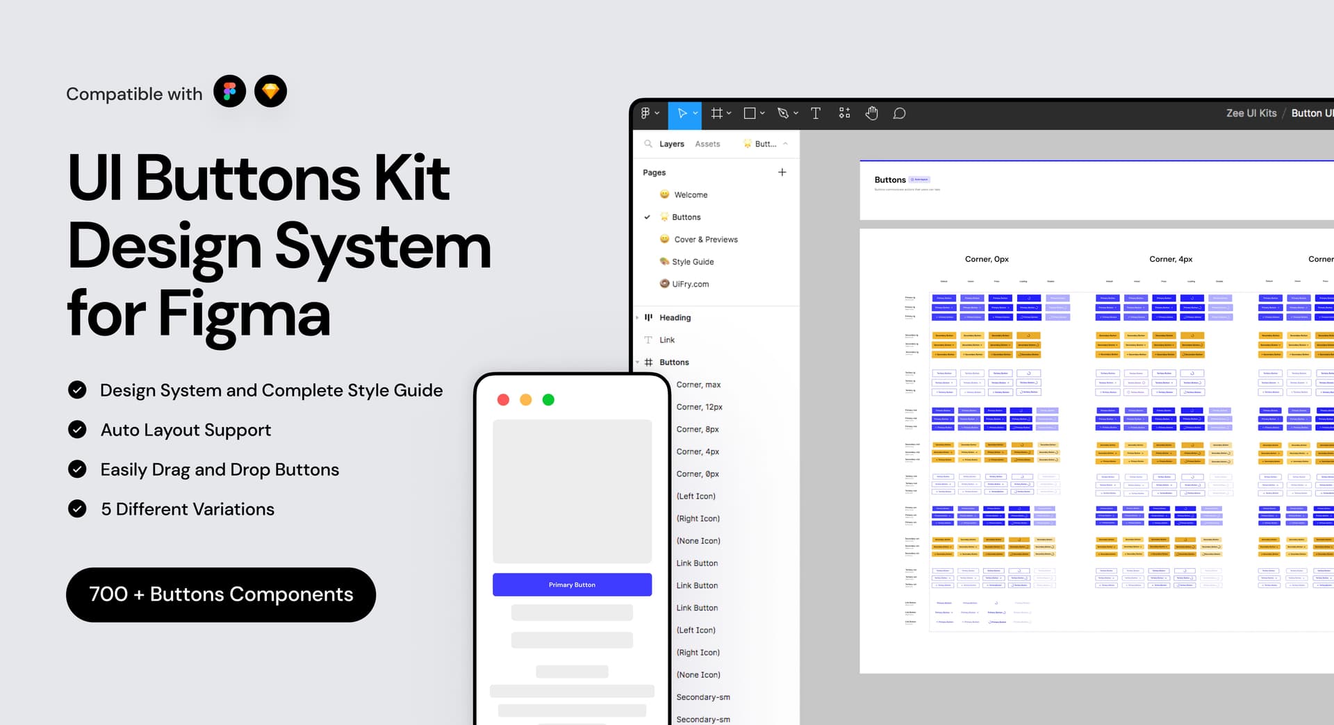
Button UI Kit
The Button UI Kits is a comprehensive design resource exclusively available in Figma. It comprises over 700+ collections, complete with a Design System & style guide, Autolayout Support, Easily Drag & Drop and five different Variations. With this kit, designers can swiftly create visually appealing and user-friendly interfaces for apps and more. The pre-designed collections, along with the included style guide and components, ensure design consistency and expedite the development process for a seamless app experience.