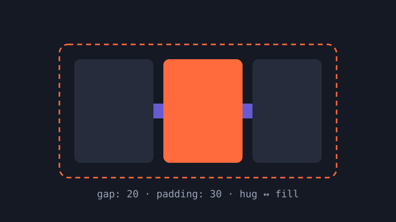
Figma Auto Layout, explained: components that resize themselves
Auto layout is the single feature that separates tidy Figma files from fragile ones. Here is a practical mental model, plus the settings that matter most.
// fresh UI, served hot
UIFry is an independent design editorial. We dig into UI kits, Figma workflows, design systems and component patterns, and explain the craft decisions behind interfaces that feel effortless.
6 guides · updated monthly
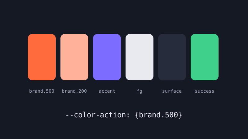
Tokens are the smallest, most boring part of a design system, and the part that saves the most time. What they are, how to name them, and where to start.
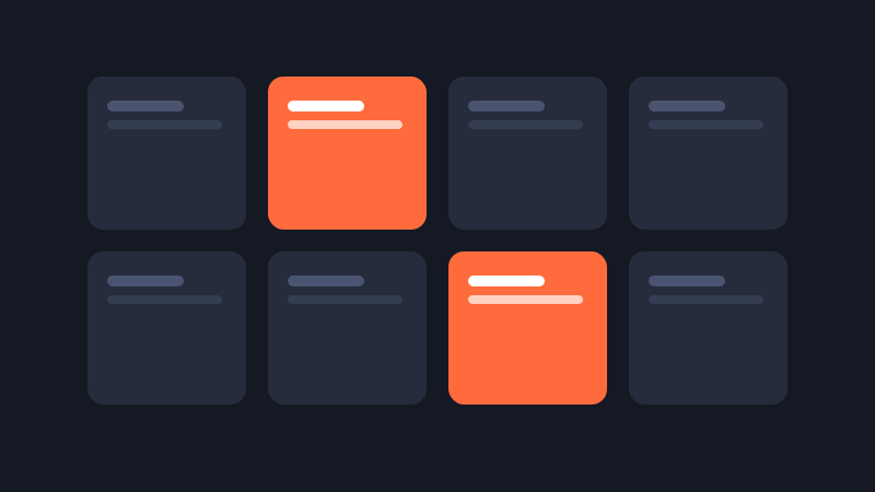
A good UI kit can save weeks. A bad one quietly dictates every decision you make. Seven questions to ask before you hit download.
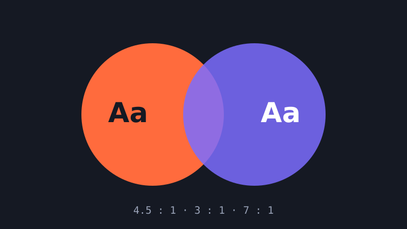
Accessibility does not mean beige. How to meet contrast requirements while keeping a vivid, distinctive brand palette.
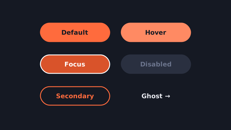
The humble button is the most-used component in any product. Getting its states and hierarchy right pays off on every single screen.
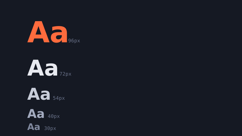
Marketing pages can afford dramatic typography. Dense product screens need a scale that is calm, legible and easy to reuse. Here is how to build one.
// why we write
The internet is full of beautiful interface shots: perfect dashboards with perfectly round numbers, onboarding flows with no error states, mobile apps where every name fits neatly on one line. They are fun to scroll and almost useless when you sit down to design something real.
UIFry exists for the moment after the mood board. We write about the parts of interface design that make or break a product but rarely make it onto a portfolio: how a component resizes when the content changes, how to name a colour token so that dark mode does not become a rewrite, how to tell whether the UI kit you just downloaded will help you or quietly box you in, and how to hit accessibility targets without draining the personality from a brand.
Each guide is written by working product designers and checked against the tools as they exist today. We focus on durable principles first and tool-specific tips second, so that what you learn here still applies when the next version of your favourite design app ships.
Every article ends with something you can apply in your next file: a checklist, a pattern, or a set of numbers to start from.
We cover Figma in depth, but explain concepts in terms that map to code, so designers and developers can share the same vocabulary.
Contrast, focus states, touch targets and plain-language labels are part of every pattern we publish, not an afterthought.
No sponsored rankings and no affiliate “best of” lists. When we recommend an approach, it is because we use it.