Building accessible colour palettes that still feel bold
Accessibility does not mean beige. How to meet contrast requirements while keeping a vivid, distinctive brand palette.
There is a persistent myth that accessible colour means a muted, cautious interface. In practice, most of the best-looking products on the web meet contrast guidelines comfortably. The trick is to build contrast into the palette from the start rather than testing individual colour pairs at the end.
The numbers you need
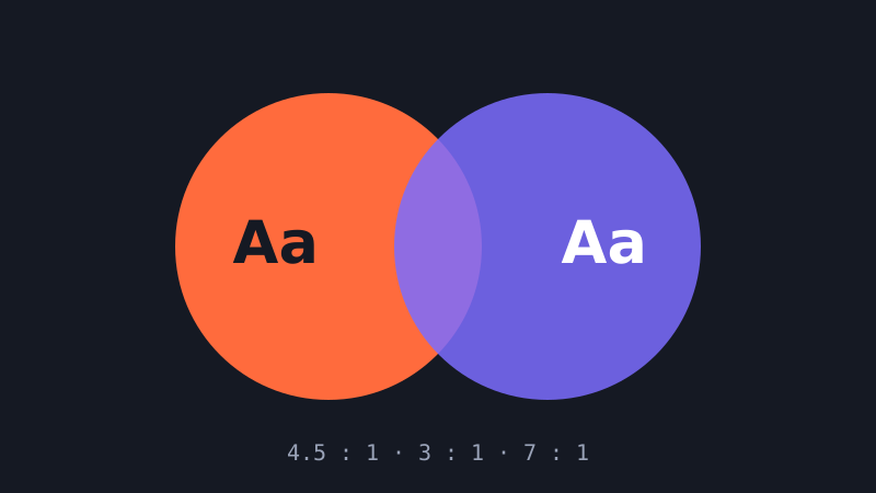
The Web Content Accessibility Guidelines (WCAG) define contrast as a ratio between two colours, from 1:1 (identical) to 21:1 (black on white). For level AA, normal body text needs at least 4.5:1 against its background, while large text (roughly 24 pixels regular or 19 pixels bold and above) needs 3:1. Meaningful non-text elements, such as input borders, focus rings and icons that convey information, also need 3:1 against adjacent colours. Level AAA raises the bar for text to 7:1.
Build scales, not swatches
Instead of a single brand orange, define a scale of ten or so steps from very light to very dark. Use a perceptually uniform colour space such as OKLCH to generate it, so that each step feels evenly spaced to the eye. Then note which steps pass 4.5:1 against white and against your darkest neutral. You will quickly learn rules like “text on white uses step 700 or darker” and “text on brand-500 is always the dark neutral”.
Let the vivid colour be a surface
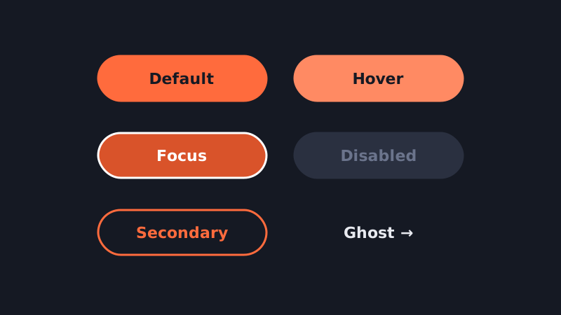
Bright, saturated colours often fail as text but shine as backgrounds, illustrations and large shapes. A vivid orange button with near-black label text can pass easily, while the same orange used as link text on white may not. Reserve your loudest colours for surfaces and pair them with a text colour chosen for contrast.
Do not rely on colour alone
Around one in twelve men and one in two hundred women have some form of colour vision deficiency. Red and green status indicators, chart series distinguished only by hue, and links identified only by colour can all become invisible. Add icons, labels, patterns or underlines so that meaning survives without colour.
Dark mode needs its own pass
Inverting a light palette rarely works. Pure white text on pure black can cause halation for some readers, and saturated colours appear to vibrate against dark backgrounds. Use an off-black background, slightly desaturate accent colours, and re-check every semantic pair in your dark theme. Design tokens make this manageable: remap semantic tokens per mode instead of editing components.
Tools that help
Contrast checker plugins in Figma, the colour picker in browser developer tools and dedicated palette generators all report ratios instantly. Make checking a habit while you design rather than a gate at the end.
Bold and accessible are not opposites. A palette built on deliberate scales gives you both, and makes every future colour decision faster.