Anatomy of a button: states, variants and the patterns behind them
The humble button is the most-used component in any product. Getting its states and hierarchy right pays off on every single screen.
Buttons look simple, which is exactly why they are so often inconsistent. Audit an older product and you will typically find a dozen slightly different blues, three corner radii, buttons that look disabled but are not, and links styled as buttons styled as links. A well-designed button component fixes a surprising amount of that chaos at once.
Hierarchy: primary, secondary, tertiary
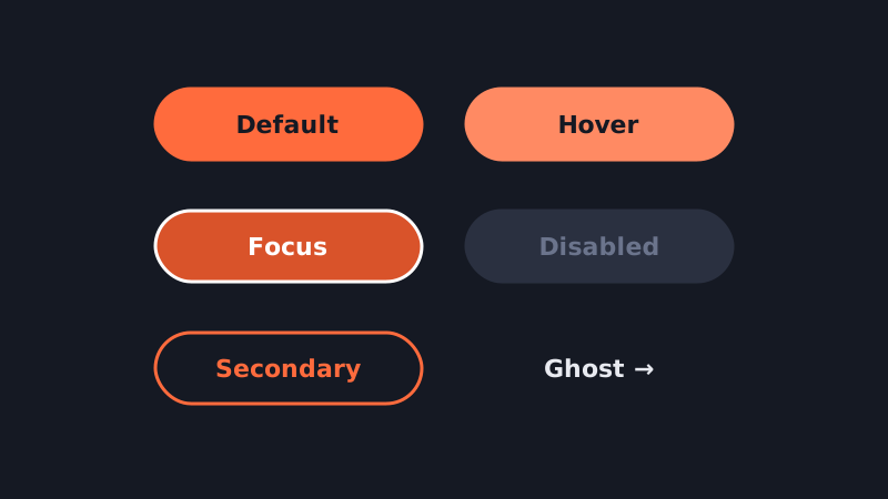
Most interfaces need three levels of emphasis. The primary button is the main action on a screen, filled with your action colour; ideally there is only one per view. The secondary button supports it, usually outlined or tinted. The tertiary or ghost button is text-only for low-priority actions such as “Cancel” or “Learn more”. A separate destructive style signals actions that delete or cannot be undone.
The states you must design
- Default — the resting appearance.
- Hover — a subtle change for pointer devices, usually a slightly lighter or darker fill.
- Focus — a clearly visible ring for keyboard users. This is not optional, and it should not be removed just because it looks unfamiliar.
- Active / pressed — brief feedback that the press registered.
- Loading — a spinner or progress indicator that keeps the button's width stable, so the layout does not jump.
- Disabled — reduced contrast and no interaction. Consider whether disabling is right at all; often it is kinder to leave the button active and explain what is missing.
Sizing and touch targets
Define two or three sizes and stick to them. On touch screens, make sure the tappable area is at least around 44 by 44 pixels, even if the visible button is smaller. Keep horizontal padding generous enough that short labels such as “OK” do not produce awkwardly tiny buttons; a minimum width helps.
Labels are part of the component
Write labels as verbs that describe the outcome: “Save changes”, “Send invoice”, “Create project”. Avoid vague words like “Submit” or “Yes” when a more specific label is possible. Sentence case is easier to read than all caps.
Icons and buttons
Leading icons can reinforce meaning; trailing icons often signal direction or a menu. Icon-only buttons need an accessible name, such as an aria-label, and ideally a tooltip, because a lone icon is rarely as obvious as designers hope.
Building it in Figma
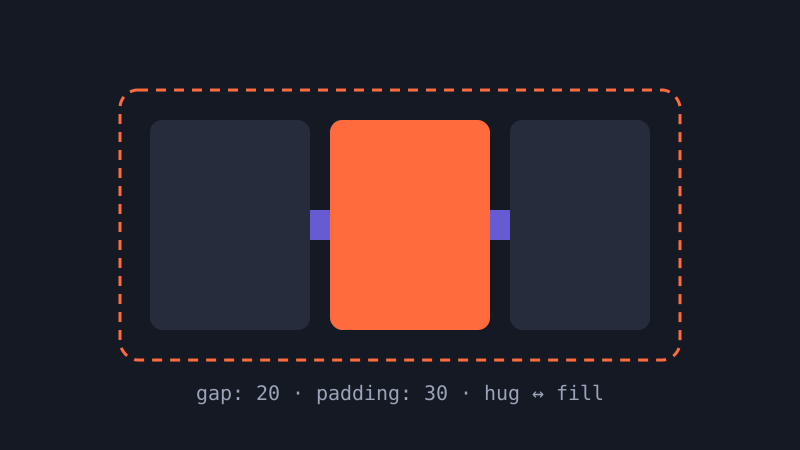
Create a single button component set with variant properties for hierarchy, size and state, plus boolean properties for leading and trailing icons and a text property for the label. Build it with auto layout so the width hugs the label. With that one component in place, every screen in your file gets more consistent automatically.