Figma Auto Layout, explained: components that resize themselves
Auto layout is the single feature that separates tidy Figma files from fragile ones. Here is a practical mental model, plus the settings that matter most.
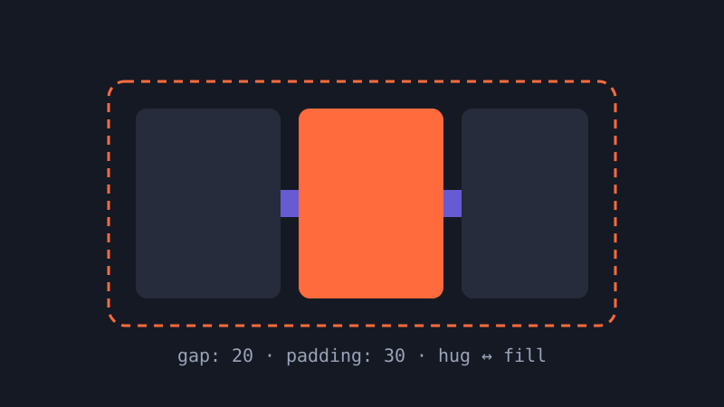
If you have ever nudged a button label, watched the text spill out of its container and then spent five minutes resizing frames by hand, auto layout is the fix. It turns a frame into something closer to a CSS flexbox: children are stacked in a direction, separated by a consistent gap, wrapped in padding, and the parent can grow or shrink to fit them. Once a component is built this way, editing content no longer breaks the layout.
The mental model: direction, gap, padding
Every auto layout frame answers three questions. Which direction do the children flow, horizontally or vertically (or wrapping onto new rows)? How much space sits between each child? And how much padding separates the children from the frame's edges? Set those three numbers with values from your spacing scale — 4, 8, 12, 16, 24, 32 — and you have already eliminated most of the visual inconsistency in a typical file.
Hug, fill and fixed
Resizing behaviour is where most confusion lives. Each layer inside an auto layout frame, and the frame itself, has a horizontal and a vertical sizing mode:
- Hug contents makes the frame exactly as big as its children plus padding. Buttons and tags usually hug horizontally.
- Fill container stretches a child to take up the remaining space in its parent. Text inputs and card bodies usually fill.
- Fixed keeps an explicit size, which is right for icons, avatars and anything that must not change.
A useful rule of thumb: containers hug, content fills, media is fixed. When something behaves strangely, inspect each layer from the inside out and check those two settings.
Nesting is the real superpower
Real interfaces are rarely a single row or column. A list item might be a horizontal frame containing an avatar, a vertical stack of title and subtitle, and a trailing icon. Model that as nested auto layout frames and the whole item adapts gracefully when a name is long, a subtitle is missing or the screen is narrower. Resist the urge to flatten everything into one frame; small, single-purpose stacks are easier to reason about and closer to how developers will build them.
Spacing modes and alignment
Set the gap to auto (space between) when you want children pushed to opposite ends, such as a title on the left and an action on the right. Use the alignment grid in the panel to choose how children sit on the cross axis. For text-heavy components, aligning to the baseline keeps mixed font sizes looking deliberate.
Min and max widths
Min and max width constraints stop a filling layer from becoming absurdly wide or crushed. Give body copy a max width of around 640 pixels and a card a sensible min width, and your components will survive being dropped into layouts you never planned for.
A quick checklist
- Use spacing values from your scale for every gap and padding.
- Name your frames — “Content”, “Actions” — so the layers panel reads like markup.
- Test each component by typing a very long and a very short label.
- Expose text and boolean properties so instances can be customised without detaching.
Auto layout takes an afternoon to learn and a few weeks to become instinctive. After that, you will wonder how you ever pushed pixels by hand.